

阅读(4704)
赞(0)
Element-React Progress 进度条
2020-10-15 17:58:46 更新
用于展示操作进度,告知用户当前状态和预期。
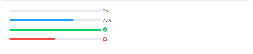
线形进度条 — 百分比外显
Progress 组件设置percentage属性即可,表示进度条对应的百分比,必填,必须在 0-100。
render() {
return (
<div>
<Progress percentage={0} />
<Progress percentage={70} />
<Progress percentage={100} status="success" />
<Progress percentage={50} status="exception" />
</div>
)
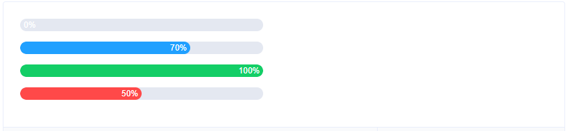
}线形进度条 — 百分比内显
百分比不占用额外控件,适用于文件上传等场景。
Progress 组件可通过 strokeWidth 属性更改进度条的高度,并可通过 textInside 属性来将进度条描述置于进度条内部。
render() {
return (
<div>
<Progress strokeWidth={18} percentage={0} textInside />
<Progress strokeWidth={18} percentage={70} textInside />
<Progress strokeWidth={18} percentage={100} status="success" textInside />
<Progress strokeWidth={18} percentage={50} status="exception" textInside />
</div>
)
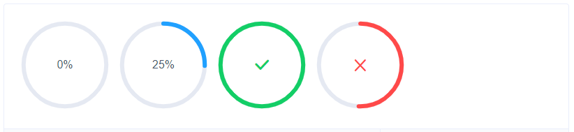
}环形进度条
Progress 组件可通过 type 属性来指定使用环形进度条,在环形进度条中,还可以通过 width 属性来设置其大小。
render() {
  return (
    <div>
      <Progress type="circle" percentage={0} />
      <Progress type="circle" percentage={25} />
      <Progress type="circle" percentage={100} status="success" />
      <Progress type="circle" percentage={50} status="exception" />
    </div>
  )
}
Attributes
| 参数 | 说明 | 类型 | 可选值 | 默认值 |
|---|---|---|---|---|
| percentage | 百分比(必填) | number | 0-100 | 0 |
| type | 进度条类型 | string | line/circle | line |
| strokeWidth | 进度条的宽度,单位 px | number | — | 6 |
| textInside | 进度条显示文字内置在进度条内(只在 type=line 时可用) | Boolean | — | false |
| status | 进度条当前状态 | string | success/exception | — |
| width | 环形进度条画布宽度(只在 type=circle 时可用) | number | 126 | |
| showText | 是否显示进度条文字内容 | boolean | — | true |