

阅读(2628)
赞(0)
ElementPlus Progress 进度条
2021-09-07 17:54:11 更新
Progress 进度条
用于展示操作进度,告知用户当前状态和预期。
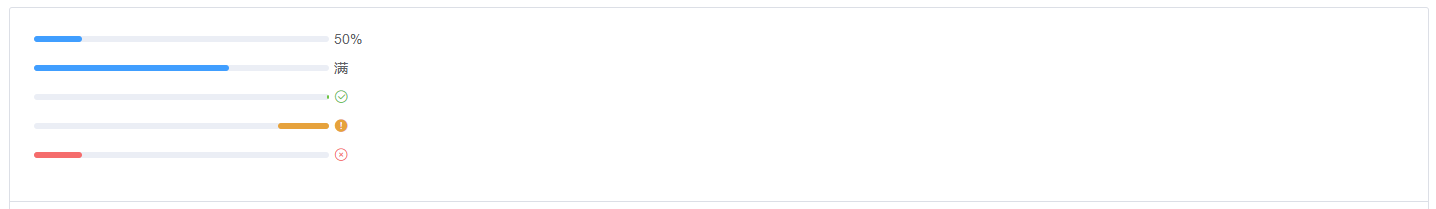
线形进度条
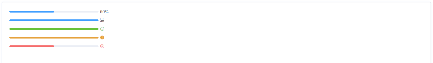
Progress 组件设置percentage属性即可,表示进度条对应的百分比,必填,必须在 0-100。通过 format 属性来指定进度条文字内容。
<template>
  <el-progress :percentage="50"></el-progress>
  <el-progress :percentage="100" :format="format"></el-progress>
  <el-progress :percentage="100" status="success"></el-progress>
  <el-progress :percentage="100" status="warning"></el-progress>
  <el-progress :percentage="50" status="exception"></el-progress>
</template>

<script>
  export default {
    methods: {
      format(percentage) {
        return percentage === 100 ? '满' : `${percentage}%`
      },
    },
  }
</script>
百分比内显
百分比不占用额外控件,适用于文件上传等场景。
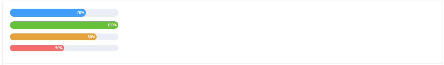
Progress 组件可通过 stroke-width 属性更改进度条的高度,并可通过 text-inside 属性来将进度条描述置于进度条内部。
<template>
  <el-progress
    :text-inside="true"
    :stroke-width="26"
    :percentage="70"
  ></el-progress>
  <el-progress
    :text-inside="true"
    :stroke-width="24"
    :percentage="100"
    status="success"
  ></el-progress>
  <el-progress
    :text-inside="true"
    :stroke-width="22"
    :percentage="80"
    status="warning"
  ></el-progress>
  <el-progress
    :text-inside="true"
    :stroke-width="20"
    :percentage="50"
    status="exception"
  ></el-progress>
</template>
自定义颜色
可以通过 color 设置进度条的颜色,color 可以接受颜色字符串,函数和数组。
<template>
  <el-progress :percentage="percentage" :color="customColor"></el-progress>

  <el-progress
    :percentage="percentage"
    :color="customColorMethod"
  ></el-progress>

  <el-progress :percentage="percentage" :color="customColors"></el-progress>

  <el-progress :percentage="percentage2" :color="customColors"></el-progress>
  <div>
    <el-button-group>
      <el-button icon="el-icon-minus" @click="decrease"></el-button>
      <el-button icon="el-icon-plus" @click="increase"></el-button>
    </el-button-group>
  </div>
</template>

<script>
  export default {
    data() {
      return {
        percentage: 20,
        percentage2: 0,
        customColor: '#409eff',
        customColors: [
          { color: '#f56c6c', percentage: 20 },
          { color: '#e6a23c', percentage: 40 },
          { color: '#5cb87a', percentage: 60 },
          { color: '#1989fa', percentage: 80 },
          { color: '#6f7ad3', percentage: 100 },
        ],
      }
    },
    methods: {
      customColorMethod(percentage) {
        if (percentage < 30) {
          return '#909399'
        } else if (percentage < 70) {
          return '#e6a23c'
        } else {
          return '#67c23a'
        }
      },
      increase() {
        this.percentage += 10
        if (this.percentage > 100) {
          this.percentage = 100
        }
      },
      decrease() {
        this.percentage -= 10
        if (this.percentage < 0) {
          this.percentage = 0
        }
      },
    },
    mounted() {
      setInterval(() => {
        this.percentage2 = (this.percentage2 % 100) + 10
      }, 500)
    },
  }
</script>
环形进度条
Progress 组件可通过 type 属性来指定使用环形进度条,在环形进度条中,还可以通过 width 属性来设置其大小。
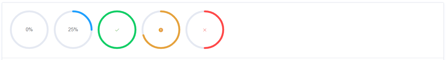
<template>
  <el-progress type="circle" :percentage="0"></el-progress>
  <el-progress type="circle" :percentage="25"></el-progress>
  <el-progress type="circle" :percentage="100" status="success"></el-progress>
  <el-progress type="circle" :percentage="70" status="warning"></el-progress>
  <el-progress type="circle" :percentage="50" status="exception"></el-progress>
</template>
仪表盘形进度条

通过 type 属性来指定使用仪表盘形进度条。
<template>
  <el-progress
    type="dashboard"
    :percentage="percentage"
    :color="colors"
  ></el-progress>
  <el-progress
    type="dashboard"
    :percentage="percentage2"
    :color="colors"
  ></el-progress>
  <div>
    <el-button-group>
      <el-button icon="el-icon-minus" @click="decrease"></el-button>
      <el-button icon="el-icon-plus" @click="increase"></el-button>
    </el-button-group>
  </div>
</template>

<script>
  export default {
    data() {
      return {
        percentage: 10,
        percentage2: 0,
        colors: [
          { color: '#f56c6c', percentage: 20 },
          { color: '#e6a23c', percentage: 40 },
          { color: '#5cb87a', percentage: 60 },
          { color: '#1989fa', percentage: 80 },
          { color: '#6f7ad3', percentage: 100 },
        ],
      }
    },
    methods: {
      increase() {
        this.percentage += 10
        if (this.percentage > 100) {
          this.percentage = 100
        }
      },
      decrease() {
        this.percentage -= 10
        if (this.percentage < 0) {
          this.percentage = 0
        }
      },
    },
    mounted() {
      setInterval(() => {
        this.percentage2 = (this.percentage2 % 100) + 10
      }, 500)
    },
  }
</script>
自定义内容
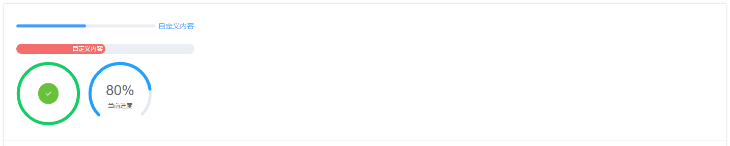
通过默认插槽添加自定义内容。
<template>
  <el-progress :percentage="50">
    <el-button type="text">自定义内容</el-button>
  </el-progress>
  <el-progress
    :text-inside="true"
    :stroke-width="20"
    :percentage="50"
    status="exception"
  >
    <span>自定义内容</span>
  </el-progress>
  <el-progress type="circle" :percentage="100" status="success">
    <el-button type="success" icon="el-icon-check" circle></el-button>
  </el-progress>
  <el-progress type="dashboard" :percentage="80">
    <template #default="{ percentage }">
      <span class="percentage-value">{{ percentage }}%</span>
      <span class="percentage-label">当前进度</span>
    </template>
  </el-progress>
</template>
动画进度条
Progress 组件设置 indeterminate 属性控制进度条运动。通过设置 duration 属性可以控制运动速度。
<template>
  <el-progress :percentage="50" :indeterminate="true"></el-progress>
  <el-progress
    :percentage="100"
    :format="format"
    :indeterminate="true"
  ></el-progress>
  <el-progress
    :percentage="100"
    status="success"
    :indeterminate="true"
    :duration="5"
  ></el-progress>
  <el-progress
    :percentage="100"
    status="warning"
    :indeterminate="true"
    :duration="1"
  ></el-progress>
  <el-progress
    :percentage="50"
    status="exception"
    :indeterminate="true"
  ></el-progress>
</template>

<script>
  export default {
    methods: {
      format(percentage) {
        return percentage === 100 ? '满' : `${percentage}%`
      },
    },
  }
</script>
Attributes
| 参数 | 说明 | 类型 | 可选值 | 默认值 |
|---|---|---|---|---|
| percentage | 百分比(必填) | number | 0-100 | 0 |
| type | 进度条类型 | string | line/circle/dashboard | line |
| stroke-width | 进度条的宽度,单位 px | number | — | 6 |
| text-inside | 进度条显示文字内置在进度条内(只在 type=line 时可用) | boolean | — | false |
| status | 进度条当前状态 | string | success/exception/warning | — |
| indeterminate | 是否为动画进度条 | boolean | - | false |
| duration | 控制动画进度条速度 | number | - | 3 |
| color | 进度条背景色(会覆盖 status 状态颜色) | string/function/array | — | '' |
| width | 环形进度条画布宽度(只在 type 为 circle 或 dashboard 时可用) | number | 126 | |
| show-text | 是否显示进度条文字内容 | boolean | — | true |
| stroke-linecap | circle/dashboard 类型路径两端的形状 | string | butt/round/square | round |
| format | 指定进度条文字内容 | function(percentage) | — | — |
Slot
| name | 说明 |
|---|---|
| default | 自定义内容,参数为 { percentage } |