

阅读(3733)
赞(0)
ElementPlus Layout 布局
2021-09-06 17:07:31 更新
Layout 布局
通过基础的 24 分栏,迅速简便地创建布局。
组件默认采用了 flex 布局,无需手动设置 type="flex"。
请注意父容器避免使用 inline 相关样式,会导致组件宽度不能撑满。
基础布局
使用单一分栏创建基础的栅格布局。
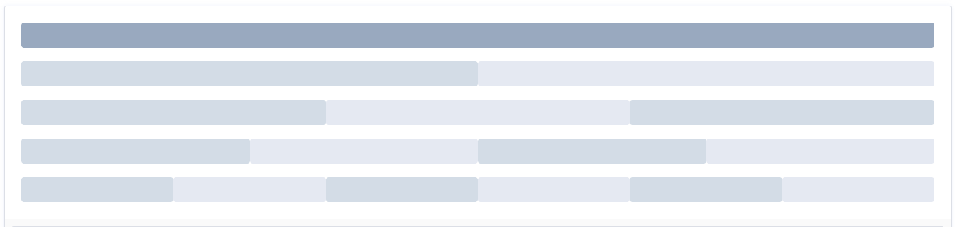
通过 row 和 col 组件,并通过 col 组件的 span 属性我们就可以自由地组合布局。
<template>
  <el-row>
  <el-col :span="24"><div class="grid-content bg-purple-dark"></div></el-col>
</el-row>
<el-row>
  <el-col :span="12"><div class="grid-content bg-purple"></div></el-col>
  <el-col :span="12"><div class="grid-content bg-purple-light"></div></el-col>
</el-row>
<el-row>
  <el-col :span="8"><div class="grid-content bg-purple"></div></el-col>
  <el-col :span="8"><div class="grid-content bg-purple-light"></div></el-col>
  <el-col :span="8"><div class="grid-content bg-purple"></div></el-col>
</el-row>
<el-row>
  <el-col :span="6"><div class="grid-content bg-purple"></div></el-col>
  <el-col :span="6"><div class="grid-content bg-purple-light"></div></el-col>
  <el-col :span="6"><div class="grid-content bg-purple"></div></el-col>
  <el-col :span="6"><div class="grid-content bg-purple-light"></div></el-col>
</el-row>
<el-row>
  <el-col :span="4"><div class="grid-content bg-purple"></div></el-col>
  <el-col :span="4"><div class="grid-content bg-purple-light"></div></el-col>
  <el-col :span="4"><div class="grid-content bg-purple"></div></el-col>
  <el-col :span="4"><div class="grid-content bg-purple-light"></div></el-col>
  <el-col :span="4"><div class="grid-content bg-purple"></div></el-col>
  <el-col :span="4"><div class="grid-content bg-purple-light"></div></el-col>
</el-row>
</template>

<style>
  .el-row {
    margin-bottom: 20px;
    &:last-child {
      margin-bottom: 0;
    }
  }
  .el-col {
    border-radius: 4px;
  }
  .bg-purple-dark {
    background: #99a9bf;
  }
  .bg-purple {
    background: #d3dce6;
  }
  .bg-purple-light {
    background: #e5e9f2;
  }
  .grid-content {
    border-radius: 4px;
    min-height: 36px;
  }
  .row-bg {
    padding: 10px 0;
    background-color: #f9fafc;
  }
</style>
分栏间隔
分栏之间存在间隔。

Row 组件 提供
gutter属性来指定每一栏之间的间隔,默认间隔为 0。
<template>
  <el-row :gutter="20">
  <el-col :span="6"><div class="grid-content bg-purple"></div></el-col>
  <el-col :span="6"><div class="grid-content bg-purple"></div></el-col>
  <el-col :span="6"><div class="grid-content bg-purple"></div></el-col>
  <el-col :span="6"><div class="grid-content bg-purple"></div></el-col>
</el-row>
</template>

<style>
  .el-row {
    margin-bottom: 20px;
    &:last-child {
      margin-bottom: 0;
    }
  }
  .el-col {
    border-radius: 4px;
  }
  .bg-purple-dark {
    background: #99a9bf;
  }
  .bg-purple {
    background: #d3dce6;
 }
  .bg-purple-light {
    background: #e5e9f2;
  }
  .grid-content {
    border-radius: 4px;
    min-height: 36px;
  }
  .row-bg {
    padding: 10px 0;
    background-color: #f9fafc;
  }
</style>
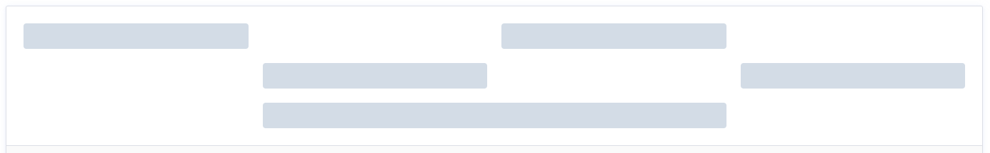
混合布局
通过基础的 1/24 分栏任意扩展组合形成较为复杂的混合布局。
<template>
<el-row :gutter="20">
<el-col :span="16"><div class="grid-content bg-purple"></div></el-col>
<el-col :span="8"><div class="grid-content bg-purple"></div></el-col>
</el-row>
<el-row :gutter="20">
<el-col :span="8"><div class="grid-content bg-purple"></div></el-col>
<el-col :span="8"><div class="grid-content bg-purple"></div></el-col>
<el-col :span="4"><div class="grid-content bg-purple"></div></el-col>
<el-col :span="4"><div class="grid-content bg-purple"></div></el-col>
</el-row>
<el-row :gutter="20">
<el-col :span="4"><div class="grid-content bg-purple"></div></el-col>
<el-col :span="16"><div class="grid-content bg-purple"></div></el-col>
<el-col :span="4"><div class="grid-content bg-purple"></div></el-col>
</el-row>
</template>
<style>
.el-row {
margin-bottom: 20px;
&:last-child {
margin-bottom: 0;
}
}
.el-col {
border-radius: 4px;
}
.bg-purple-dark {
background: #99a9bf;
}
.bg-purple {
background: #d3dce6;
}
.bg-purple-light {
background: #e5e9f2;
}
.grid-content {
border-radius: 4px;
min-height: 36px;
}
.row-bg {
padding: 10px 0;
background-color: #f9fafc;
}
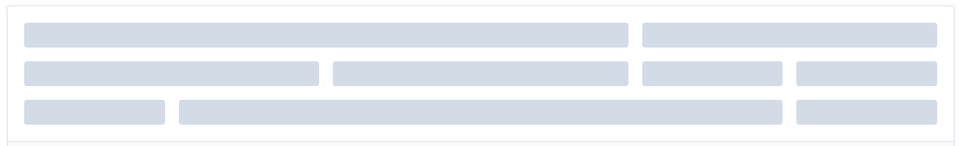
</style>分栏偏移
支持偏移指定的栏数。
通过制定 col 组件的
offset属性可以指定分栏偏移的栏数。
<template>
  <el-row :gutter="20">
  <el-col :span="6"><div class="grid-content bg-purple"></div></el-col>
  <el-col :span="6" :offset="6"
    ><div class="grid-content bg-purple"></div
  ></el-col>
</el-row>
<el-row :gutter="20">
  <el-col :span="6" :offset="6"
    ><div class="grid-content bg-purple"></div
  ></el-col>
  <el-col :span="6" :offset="6"
    ><div class="grid-content bg-purple"></div
  ></el-col>
</el-row>
<el-row :gutter="20">
  <el-col :span="12" :offset="6"
    ><div class="grid-content bg-purple"></div
  ></el-col>
</el-row>
</template>

<style>
  .el-row {
    margin-bottom: 20px;
    &:last-child {
      margin-bottom: 0;
    }
  }
  .el-col {
    border-radius: 4px;
  }
  .bg-purple-dark {
    background: #99a9bf;
  }
  .bg-purple {
    background: #d3dce6;
  }
  .bg-purple-light {
    background: #e5e9f2;
  }
  .grid-content {
    border-radius: 4px;
    min-height: 36px;
  }
  .row-bg {
    padding: 10px 0;
    background-color: #f9fafc;
  }
</style>
对齐方式
默认使用 flex 布局来对分栏进行灵活的对齐.
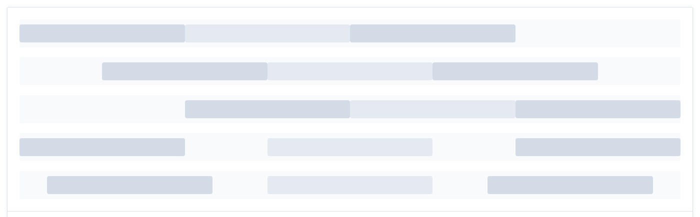
可通过
justify 属性来指定 start, center, end, space-between, space-around 其中的值来定义子元素的排版方式。
<template>
  <el-row class="row-bg">
  <el-col :span="6"><div class="grid-content bg-purple"></div></el-col>
  <el-col :span="6"><div class="grid-content bg-purple-light"></div></el-col>
  <el-col :span="6"><div class="grid-content bg-purple"></div></el-col>
</el-row>
<el-row class="row-bg" justify="center">
  <el-col :span="6"><div class="grid-content bg-purple"></div></el-col>
  <el-col :span="6"><div class="grid-content bg-purple-light"></div></el-col>
  <el-col :span="6"><div class="grid-content bg-purple"></div></el-col>
</el-row>
<el-row class="row-bg" justify="end">
  <el-col :span="6"><div class="grid-content bg-purple"></div></el-col>
  <el-col :span="6"><div class="grid-content bg-purple-light"></div></el-col>
  <el-col :span="6"><div class="grid-content bg-purple"></div></el-col>
</el-row>
<el-row class="row-bg" justify="space-between">
  <el-col :span="6"><div class="grid-content bg-purple"></div></el-col>
  <el-col :span="6"><div class="grid-content bg-purple-light"></div></el-col>
  <el-col :span="6"><div class="grid-content bg-purple"></div></el-col>
</el-row>
<el-row class="row-bg" justify="space-around">
  <el-col :span="6"><div class="grid-content bg-purple"></div></el-col>
  <el-col :span="6"><div class="grid-content bg-purple-light"></div></el-col>
  <el-col :span="6"><div class="grid-content bg-purple"></div></el-col>
</el-row>
</template>

<style>
  .el-row {
    margin-bottom: 20px;
    &:last-child {
      margin-bottom: 0;
    }
  }
  .el-col {
    border-radius: 4px;
  }
  .bg-purple-dark {
    background: #99a9bf;
  }
  .bg-purple {
    background: #d3dce6;
  }
  .bg-purple-light {
    background: #e5e9f2;
  }
  .grid-content {
    border-radius: 4px;
    min-height: 36px;
  }
  .row-bg {
    padding: 10px 0;
    background-color: #f9fafc;
  }
</style>
响应式布局
参照了 Bootstrap 的 响应式设计,预设了五个响应尺寸:xs、sm、md、lg 和 xl。

<template>
  <el-row :gutter="10">
  <el-col :xs="8" :sm="6" :md="4" :lg="3" :xl="1"
    ><div class="grid-content bg-purple"></div
  ></el-col>
  <el-col :xs="4" :sm="6" :md="8" :lg="9" :xl="11"
    ><div class="grid-content bg-purple-light"></div
  ></el-col>
  <el-col :xs="4" :sm="6" :md="8" :lg="9" :xl="11"
    ><div class="grid-content bg-purple"></div
  ></el-col>
  <el-col :xs="8" :sm="6" :md="4" :lg="3" :xl="1"
    ><div class="grid-content bg-purple-light"></div
  ></el-col>
</el-row>
</template>

<style>
  .el-col {
    border-radius: 4px;
  }
  .bg-purple-dark {
    background: #99a9bf;
  }
  .bg-purple {
    background: #d3dce6;
  }
  .bg-purple-light {
    background: #e5e9f2;
  }
  .grid-content {
    border-radius: 4px;
    min-height: 36px;
  }
</style>
基于断点的隐藏类
Element Plus 额外提供了一系列类名,用于在某些条件下隐藏元素。这些类名可以添加在任何 DOM 元素或自定义组件上。如果需要,请自行引入以下文件:
import 'element-plus/lib/theme-chalk/display.css'包含的类名及其含义为:
- hidden-xs-only - 当视口在 xs 尺寸时隐藏
- hidden-sm-only - 当视口在 sm 尺寸时隐藏
- hidden-sm-and-down - 当视口在 sm 及以下尺寸时隐藏
- hidden-sm-and-up - 当视口在 sm 及以上尺寸时隐藏
- hidden-md-only - 当视口在 md 尺寸时隐藏
- hidden-md-and-down - 当视口在 md 及以下尺寸时隐藏
- hidden-md-and-up - 当视口在 md 及以上尺寸时隐藏
- hidden-lg-only - 当视口在 lg 尺寸时隐藏
- hidden-lg-and-down - 当视口在 lg 及以下尺寸时隐藏
- hidden-lg-and-up - 当视口在 lg 及以上尺寸时隐藏
- hidden-xl-only - 当视口在 xl 尺寸时隐藏
Row Attributes
| 参数 | 说明 | 类型 | 可选值 | 默认值 |
|---|---|---|---|---|
| gutter | 栅格间隔 | number | — | 0 |
| justify | flex 布局下的水平排列方式 | string | start/end/center/space-around/space-between | start |
| align | flex 布局下的垂直排列方式 | string | top/middle/bottom | top |
| tag | 自定义元素标签 | string | * | div |
Col Attributes
| 参数 | 说明 | 类型 | 可选值 | 默认值 |
|---|---|---|---|---|
| span | 栅格占据的列数 | number | — | 24 |
| offset | 栅格左侧的间隔格数 | number | — | 0 |
| push | 栅格向右移动格数 | number | — | 0 |
| pull | 栅格向左移动格数 | number | — | 0 |
| xs | <768px 响应式栅格数或者栅格属性对象 | number/object (例如: {span: 4, offset: 4}) | — | — |
| sm | ≥768px 响应式栅格数或者栅格属性对象 | number/object (例如: {span: 4, offset: 4}) | — | — |
| md | ≥992px 响应式栅格数或者栅格属性对象 | number/object (例如: {span: 4, offset: 4}) | — | — |
| lg | ≥1200px 响应式栅格数或者栅格属性对象 | number/object (例如: {span: 4, offset: 4}) | — | — |
| xl | ≥1920px 响应式栅格数或者栅格属性对象 | number/object (例如: {span: 4, offset: 4}) | — | — |
| tag | 自定义元素标签 | string | * | div |