

阅读(2362)
赞(0)
pyecharts 组合图表
2022-10-24 09:37:51 更新
Grid:并行多图
class pyecharts.charts.Grid(Base)
class Grid(
    # 初始化配置项,参考 `global_options.InitOpts`
    init_opts: opts.InitOpts = opts.InitOpts()
)
func pyecharts.charts.Grid.add
def add(
    # 图表实例,仅 `Chart` 类或者其子类
    chart: Chart,

    # 直角坐标系网格配置项,参见 `GridOpts`
    grid_opts: Union[opts.GridOpts, dict],

    # 直角坐标系网格索引
    grid_index: int = 0,

    # 是否由自己控制 Axis 索引
    is_control_axis_index: bool = False,
)
GridOpts:直角坐标系网格配置项
class pyecharts.options.GridOpts
class GridOpts(
    # 是否显示直角坐标系网格。
    is_show: bool = False,

    # 所有图形的 zlevel 值。
    z_level: Numeric = 0,

    # 组件的所有图形的z值。
    z: Numeric = 2,

    # grid 组件离容器左侧的距离。
    # left 的值可以是像 20 这样的具体像素值,可以是像 '20%' 这样相对于容器高宽的百分比,
    # 也可以是 'left', 'center', 'right'。
    # 如果 left 的值为'left', 'center', 'right',组件会根据相应的位置自动对齐。
    pos_left: Union[Numeric, str, None] = None,

    # grid 组件离容器上侧的距离。
    # top 的值可以是像 20 这样的具体像素值,可以是像 '20%' 这样相对于容器高宽的百分比,
    # 也可以是 'top', 'middle', 'bottom'。
    # 如果 top 的值为'top', 'middle', 'bottom',组件会根据相应的位置自动对齐。
    pos_top: Union[Numeric, str, None]  = None,

    # grid 组件离容器右侧的距离。
    # right 的值可以是像 20 这样的具体像素值,可以是像 '20%' 这样相对于容器高宽的百分比。
    pos_right: Union[Numeric, str, None]  = None,

    # grid 组件离容器下侧的距离。
    # bottom 的值可以是像 20 这样的具体像素值,可以是像 '20%' 这样相对于容器高宽的百分比。
    pos_bottom: Union[Numeric, str, None]  = None,

    # grid 组件的宽度。默认自适应。
    width: Union[Numeric, str, None] = None,

    # grid 组件的高度。默认自适应。
    height: Union[Numeric, str, None] = None,

    # grid 区域是否包含坐标轴的刻度标签。
    is_contain_label: bool = False,

    # 网格背景色,默认透明。
    background_color: str = "transparent",

    # 网格的边框颜色。支持的颜色格式同 backgroundColor。
    border_color: str = "#ccc",

    # 网格的边框线宽。
    border_width: Numeric = 1,

    # 本坐标系特定的 tooltip 设定。
    tooltip_opts: Union[TooltipOpts, dict, None] = None,
)
Demo
Page:顺序多图
class pyecharts.charts.Page
class Page(
    # HTML 标题
    page_title: str = "Awesome-pyecharts",

    # 远程 HOST,默认为 "https://assets.pyecharts.org/assets/"
    js_host: str = "",

    # 每个图例之间的间隔
    interval: int = 1,

    # 布局配置项,参考 `PageLayoutOpts`
    layout: Union[PageLayoutOpts, dict] = PageLayoutOpts()
)
func pyecharts.charts.Page.add
def add(*charts) # charts: 任意图表实例class pyecharts.options.PageLayoutOpts
class PageLayoutOpts(
    # 配置均为原生 CSS 样式
    justify_content: Optional[str] = None,
    margin: Optional[str] = None,
    display: Optional[str] = None,
    flex_wrap: Optional[str] = None,
)
func pyecharts.charts.Page.save_resize_html
用于 DraggablePageLayout 布局重新渲染图表
def save_resize_html(
    # Page 第一次渲染后的 html 文件
    source: str = "render.html",
    *,
    # 布局配置文件
    cfg_file: types.Optional[str] = None,

    # 布局配置 dict
    cfg_dict: types.Optional[list] = None,

    # 重新生成的 .html 存放路径
    dest: str = "resize_render.html",
) -> str
Page 内置了以下布局
- SimplePageLayout
- DraggablePageLayout
Demo
默认布局
page = Page()
page.add(bar_datazoom_slider(), line_markpoint(), pie_rosetype(), grid_mutil_yaxis())
page.render()
SimplePageLayout 布局
page = Page(layout=Page.SimplePageLayout)
# 需要自行调整每个 chart 的 height/width,显示效果在不同的显示器上可能不同
page.add(bar_datazoom_slider(), line_markpoint(), pie_rosetype(), grid_mutil_yaxis())
page.render()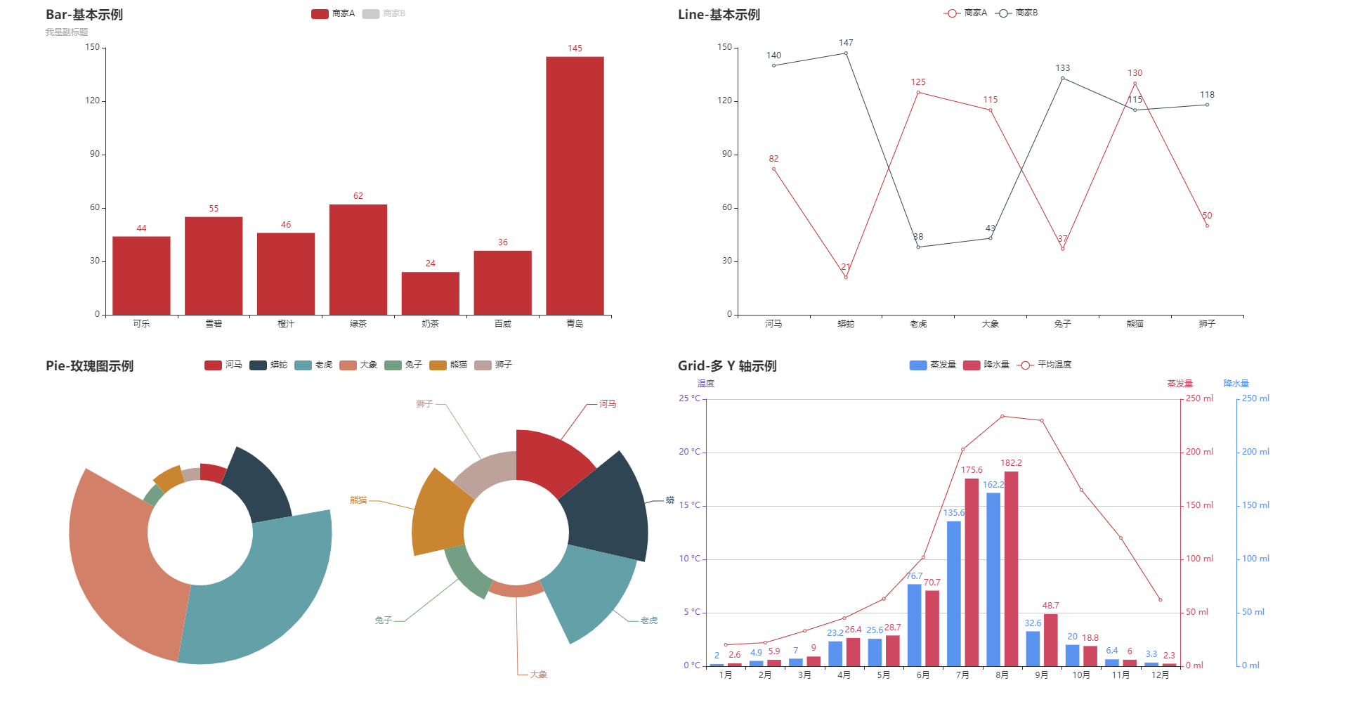
DraggablePageLayout 布局
page = Page(layout=Page.DraggablePageLayout)
page.add(bar_datazoom_slider(), line_markpoint(), pie_rosetype(), grid_mutil_yaxis())
page.render()
Note: DraggablePageLayout 需要 pyecharts 版本 v.1.4.0+
# DraggablePageLayout 利用 Jquery 以及 Echarts 本身的 resize 功能,实现了可拖拽布局。使用步骤如下
# 1.指定 Page 布局
page = Page(layout=Page.DraggablePageLayout)

# 正常 render 图表
page.add(bar_datazoom_slider(), line_markpoint(), pie_rosetype(), grid_mutil_yaxis())
page.render()

# 使用浏览器打开渲染后的 .html 文件,默认为 render.html。拖拉/调整图表位置和大小,当调整到一个适合
# 的布局时,点击左上方的 `Save Config` 按钮,下载 chart_config.json 配置文件,假设存放位置为
# ~/chart_config.json。再次渲染图表并指定其布局配置

# Warning: 请注释掉上面的的所有渲染代码,就是以下三行。因为 html 已经生成,并不需要再重新渲染一遍。
# page = Page(layout=Page.DraggablePageLayout)
# page.add(bar_datazoom_slider(), line_markpoint(), pie_rosetype(), grid_mutil_yaxis())
# page.render()

# render.html:第一步生成的原 html 文件
# chart_config.json:第二步下载的配置文件
# my_new_charts.html:新 html 文件路径
Page.save_resize_html("render.html", cfg_file="~/chart_config.json", dest="my_new_charts.html")

# 或者可以使用 json 数据
# cfg_dict 为 json 文件里面的内容
Page.save_resize_html("render.html", cfg_dict=cfg_dict, dest="my_new_charts.html")

# Question:能否复用渲染模板?
# Answer: 可以的,渲染配置 json 数据中是以 chart_id 来作为一个图形的唯一标识符的,所以只需要在
# 第一次渲染的时候指定 chart_id 就可以啦。
# example:
# bar = bar_datazoom_slider()
# bar.chart_id = "chenjiandongx_is_an_awesome_boy"
# line = line_markpoint()
# line.chart_id = "chenjiandongx_is_an_amazing_boy"
# pie = pie_rosetype()
# pie.chart_id = "chenjiandongx_is_an_adorable_boy"
# 然后只要以后都按这个 chart_id 来渲染图表的时候,你的布局配置就可以复用啦。
# cat chart_config.json,会发现 chart_id 是固定的啦。
page.add(bar_datazoom_slider(), line_markpoint(), pie_rosetype()))
演示视频
Tab:选项卡多图
class pyecharts.charts.Tab
class Tab(
    # HTML 标题
    page_title: str = "Awesome-pyecharts",

    # 远程 HOST,默认为 "https://assets.pyecharts.org/assets/"
    js_host: str = ""
)
func pyecharts.charts.Tab.add
def add(
    # 任意图表类型
    chart,

    # 标签名称
    tab_name
):
Demo
Timeline:时间线轮播多图
class pyecharts.charts.Timeline
class Timeline(
    # 初始化配置项,参考 `global_options.InitOpts`
    init_opts: opts.InitOpts = opts.InitOpts()
)
func pyecharts.charts.Timeline.add_schema
def add_schema(
    # 坐标轴类型。可选:
    # 'value': 数值轴,适用于连续数据。
    # 'category': 类目轴,适用于离散的类目数据,为该类型时必须通过 data 设置类目数据。
    # 'time': 时间轴,适用于连续的时序数据,与数值轴相比时间轴带有时间的格式化,在刻度计算上也有所不同,
    # 例如会根据跨度的范围来决定使用月,星期,日还是小时范围的刻度。
    # 'log' 对数轴。适用于对数数据。
    axis_type: str = "category",

    # 时间轴的类型。可选:
    # 'horizontal': 水平
    # 'vertical': 垂直
    orient: str = "horizontal",

    # timeline 标记的图形。
    # ECharts 提供的标记类型包括 'circle', 'rect', 'roundRect', 'triangle', 'diamond',
    # 'pin', 'arrow', 'none'
    # 可以通过 'image://url' 设置为图片,其中 URL 为图片的链接,或者 dataURI。
    symbol: Optional[str] = None,

    # timeline 标记的大小,可以设置成诸如 10 这样单一的数字,也可以用数组分开表示宽和高,
    # 例如 [20, 10] 表示标记宽为 20,高为 10。
    symbol_size: Optional[Numeric] = None,

    # 表示播放的速度(跳动的间隔),单位毫秒(ms)。
    play_interval: Optional[Numeric] = None,

    # 表示播放按钮的位置。可选值:'left'、'right'。
    control_position: str = "left",

    # 是否自动播放。
    is_auto_play: bool = False,

    # 是否循环播放。
    is_loop_play: bool = True,

    # 是否反向播放。
    is_rewind_play: bool = False,

    # 是否显示 timeline 组件。如果设置为 false,不会显示,但是功能还存在。
    is_timeline_show: bool = True,

    # 是否反向放置 timeline,反向则首位颠倒过来
    is_inverse: bool = False,

    # Timeline 组件离容器左侧的距离。
    # left 的值可以是像 20 这样的具体像素值,可以是像 '20%' 这样相对于容器高宽的百分比,
    # 也可以是 'left', 'center', 'right'。
    # 如果 left 的值为'left', 'center', 'right',组件会根据相应的位置自动对齐
    pos_left: Optional[str] = None,

    # timeline 组件离容器右侧的距离。
    # right 的值可以是像 20 这样的具体像素值,可以是像 '20%' 这样相对于容器高宽的百分比。
    pos_right: Optional[str] = None,

    # Timeline 组件离容器上侧的距离。
    # left 的值可以是像 20 这样的具体像素值,可以是像 '20%' 这样相对于容器高宽的百分比,
    # 也可以是 'top', 'middle', 'bottom'。
    # 如果 left 的值为 'top', 'middle', 'bottom',组件会根据相应的位置自动对齐
    pos_top: Optional[str] = None,

    # timeline 组件离容器下侧的距离。
    # bottom 的值可以是像 20 这样的具体像素值,可以是像 '20%' 这样相对于容器高宽的百分比。
    pos_bottom: Optional[str] = "-5px",

    # 时间轴区域的宽度, 影响垂直的时候时间轴的轴标签和轴之间的距离
    width: Optional[str] = None,

    # 时间轴区域的高度
    height: Optional[str] = None,

    # 时间轴的坐标轴线配置,参考 `series_options.LineStyleOpts`
    linestyle_opts: Union[opts.LineStyleOpts, dict, None] = None,

    # 时间轴的轴标签配置,参考 `series_options.LabelOpts`
    label_opts: Optional[opts.LabelOpts] = None,

    # 时间轴的图形样式,参考 `series_options.ItemStyleOpts`
    itemstyle_opts: Union[opts.ItemStyleOpts, dict, None] = None,

    # Graphic 样式
    graphic_opts: types.Graphic = None,

    # 『当前项』(checkpoint)的图形样式。
    checkpointstyle_opts: types.TimeLinkCheckPoint = None,

    # 控制按钮』的样式。『控制按钮』包括:『播放按钮』、『前进按钮』、『后退按钮』。
    controlstyle_opts: types.TimeLineControl = None,
)
func pyecharts.charts.Timeline.add
def add(
    # 图表实例
    chart: Base,

    # 时间点
    time_point: str
)
TimeLinkCheckPoint: 时间轴 checkpoint 样式配置
class TimelineCheckPointerStyle(
    # ECharts 提供的标记类型包括 'circle', 'rect', 'roundRect', 'triangle', 'diamond', 'pin', 'arrow', 'none'
    # 可以通过 'image://url' 设置为图片,其中 URL 为图片的链接,或者 dataURI。
    # 可以通过 'path://' 将图标设置为任意的矢量路径。
    #    这种方式相比于使用图片的方式,不用担心因为缩放而产生锯齿或模糊,而且可以设置为任意颜色。
    #    路径图形会自适应调整为合适的大小。路径的格式参见 SVG PathData。
    #    可以从 Adobe Illustrator 等工具编辑导出。
    symbol: str = "circle",

    # 标记的大小。
    symbol_size: Union[Numeric, Sequence[Numeric]] = 13,

    # 标记的旋转角度(而非弧度)。正值表示逆时针旋转。
    symbol_rotate: Optional[Numeric] = None,

    # 如果 symbol 是 path:// 的形式,是否在缩放时保持该图形的长宽比。
    symbol_keep_aspect: bool = False,

    # 标记相对于原本位置的偏移。
    symbol_offset: Optional[Sequence[Union[str, Numeric]]] = None,

    # 『当前项』(checkpoint)的颜色。
    color: str = "#c23531",

    # 『当前项』(checkpoint)的边框宽度。
    border_width: Numeric = 5,

    # 『当前项』(checkpoint)的边框颜色。
    border_color: str = "rgba(194,53,49,0.5)",

    # 『当前项』(checkpoint)在 timeline 播放切换中的移动,是否有动画。
    is_animation: bool = True,

    # 『当前项』(checkpoint)的动画时长。
    animation_duration: Numeric = 300,

    # 『当前项』(checkpoint)的动画的缓动效果。
    animation_easing: str = "quinticInOut",
)
TimelineControlStyle: 时间轴控制按钮样式
class TimelineControlStyle(
    # 是否显示『控制按钮』。设置为 false 则全不显示。
    is_show: bool = True,

    # 是否显示『播放按钮』。
    is_show_play_button: bool = True,

    # 是否显示『后退按钮』。
    is_show_prev_button: bool = True,

    # 是否显示『前进按钮』。
    is_show_next_button: bool = True,

    # 『控制按钮』的尺寸,单位为像素(px)。
    item_size: Numeric = 22,

    # 『控制按钮』的间隔,单位为像素(px)。
    item_gap: Numeric = 12,

    # 『控制按钮』的位置。
    # 当 timeline.orient 为 'horizontal'时,'left'、'right'有效。
    # 当 timeline.orient 为 'vertical'时,'top'、'bottom'有效。
    position: str = "left",

    # 『播放按钮』的『可播放状态』的图形。
    # 可以通过 'image://url' 设置为图片,其中 URL 为图片的链接,或者 dataURI。
    # 可以通过 'path://' 将图标设置为任意的矢量路径。
    #    这种方式相比于使用图片的方式,不用担心因为缩放而产生锯齿或模糊,而且可以设置为任意颜色。
    #    路径图形会自适应调整为合适的大小。路径的格式参见 SVG PathData。
    #    可以从 Adobe Illustrator 等工具编辑导出。
    play_icon: Optional[str] = None,

    # 同上
    stop_icon: Optional[str] = None,

    # 同上
    prev_icon: Optional[str] = None,

    # 同上
    next_icon: Optional[str] = None,

    # 按钮颜色。
    color: str = "#304654",

    # 按钮边框颜色。
    border_color: str = "#304654",

    # 按钮边框线宽。
    border_width: Numeric = 1,
)